ANNE-LAURE TREZEGUET
ART DIRECTION/GRAPHIC DESIGN
ABOUT
WORK WITH ME
ANNELAURE.TREZ@GMAIL.COM

@ANNELAURE_TREZ

DATE / 2021
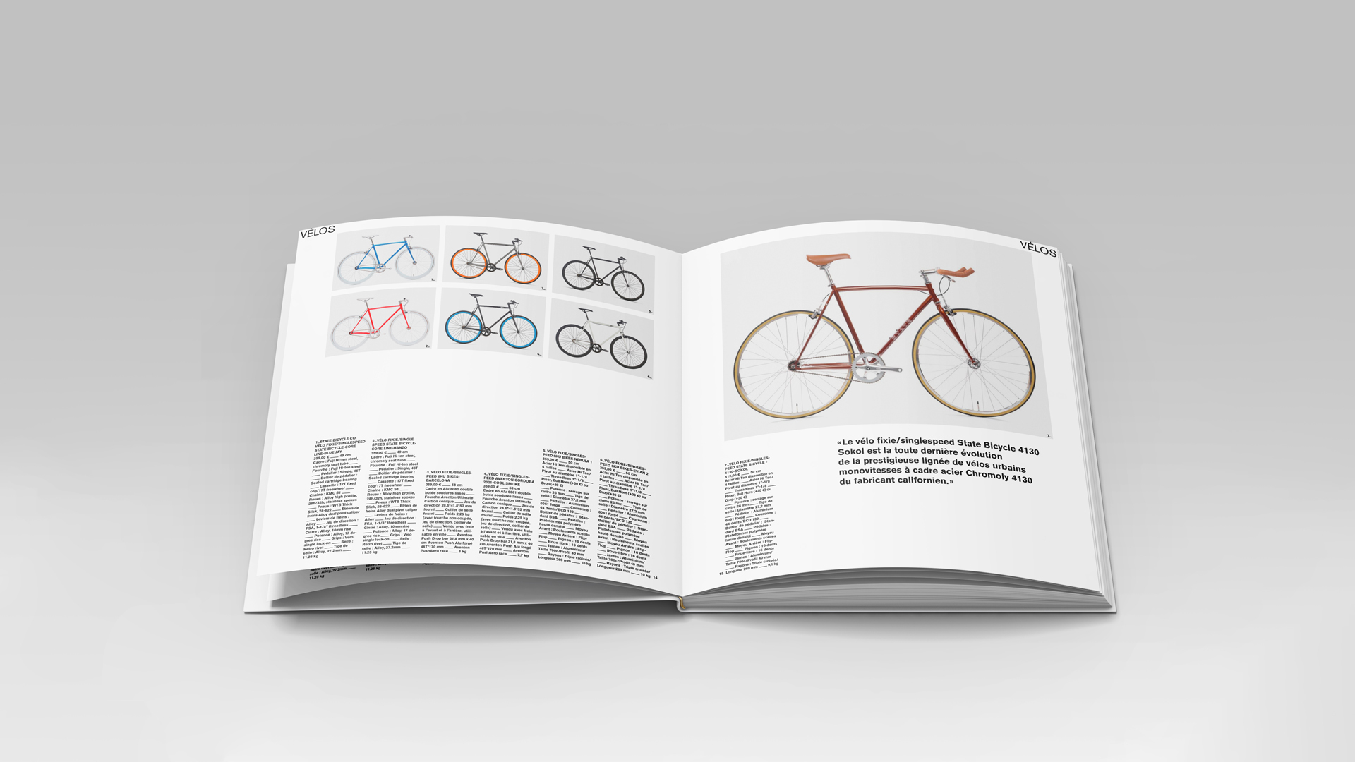
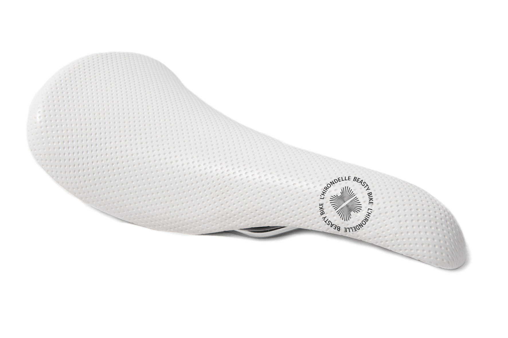
PERSONAL PROJECT /

LOGO DESIGN
VISUAL IDENTITY

DESCRIPTION /
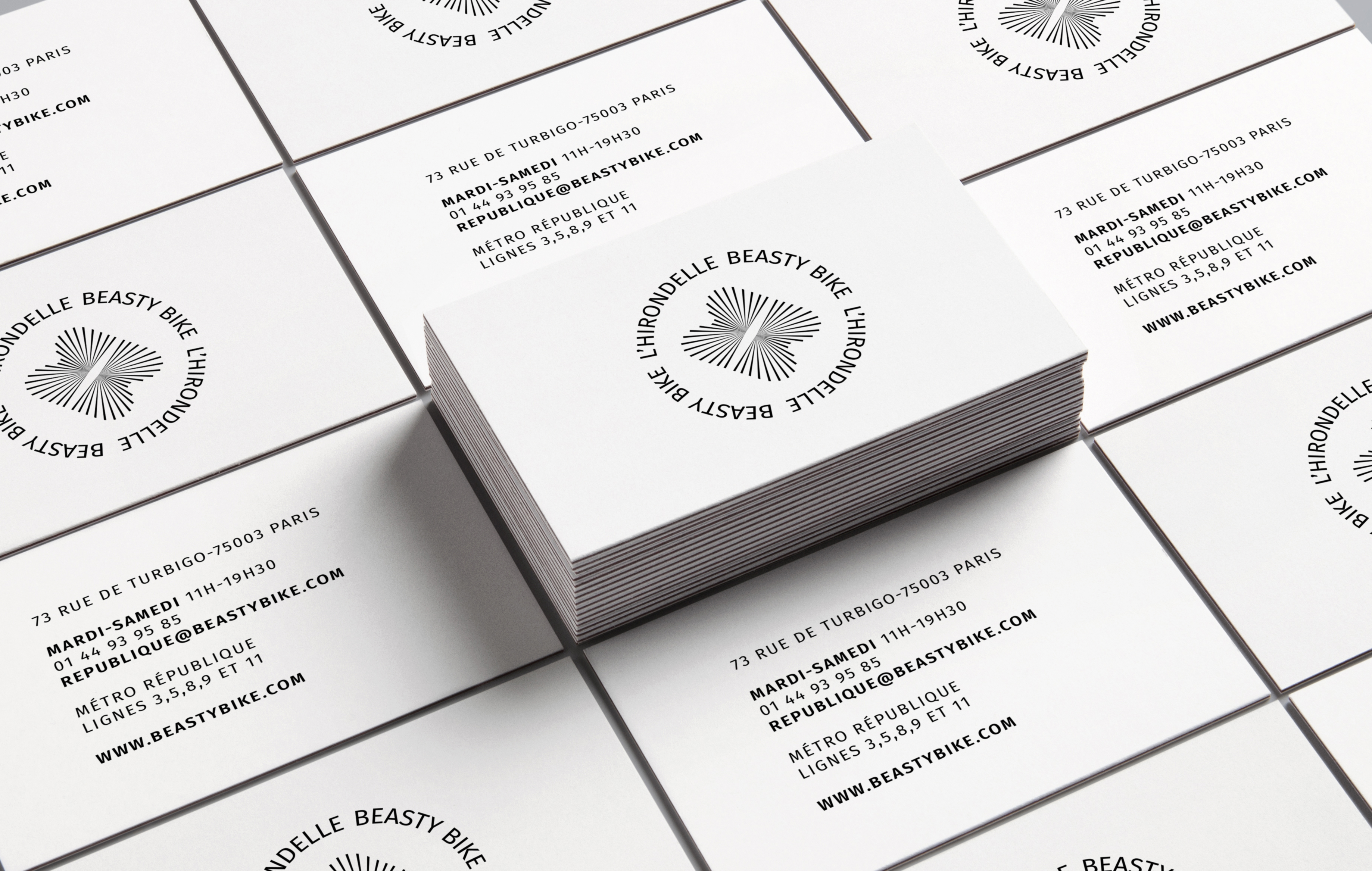
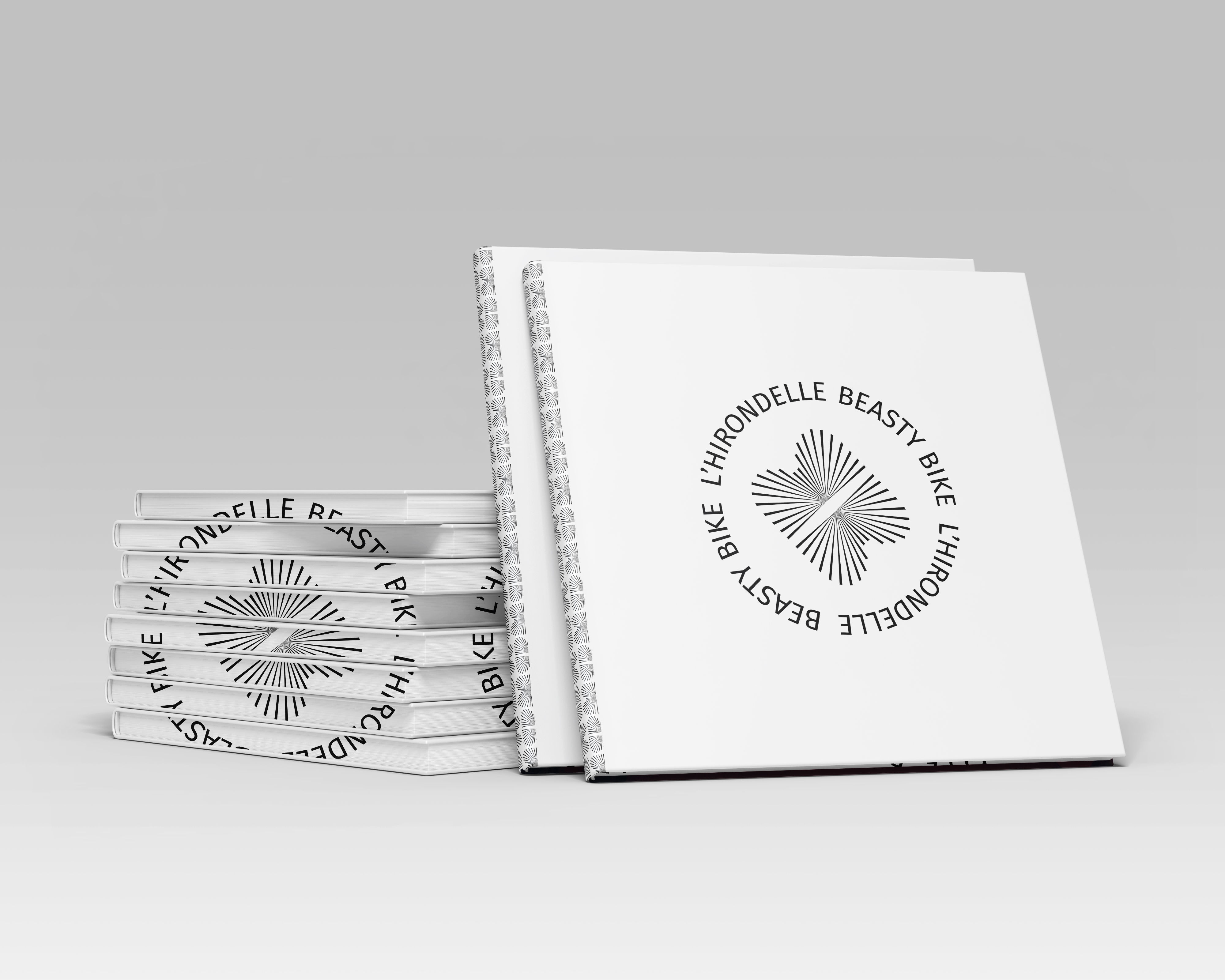
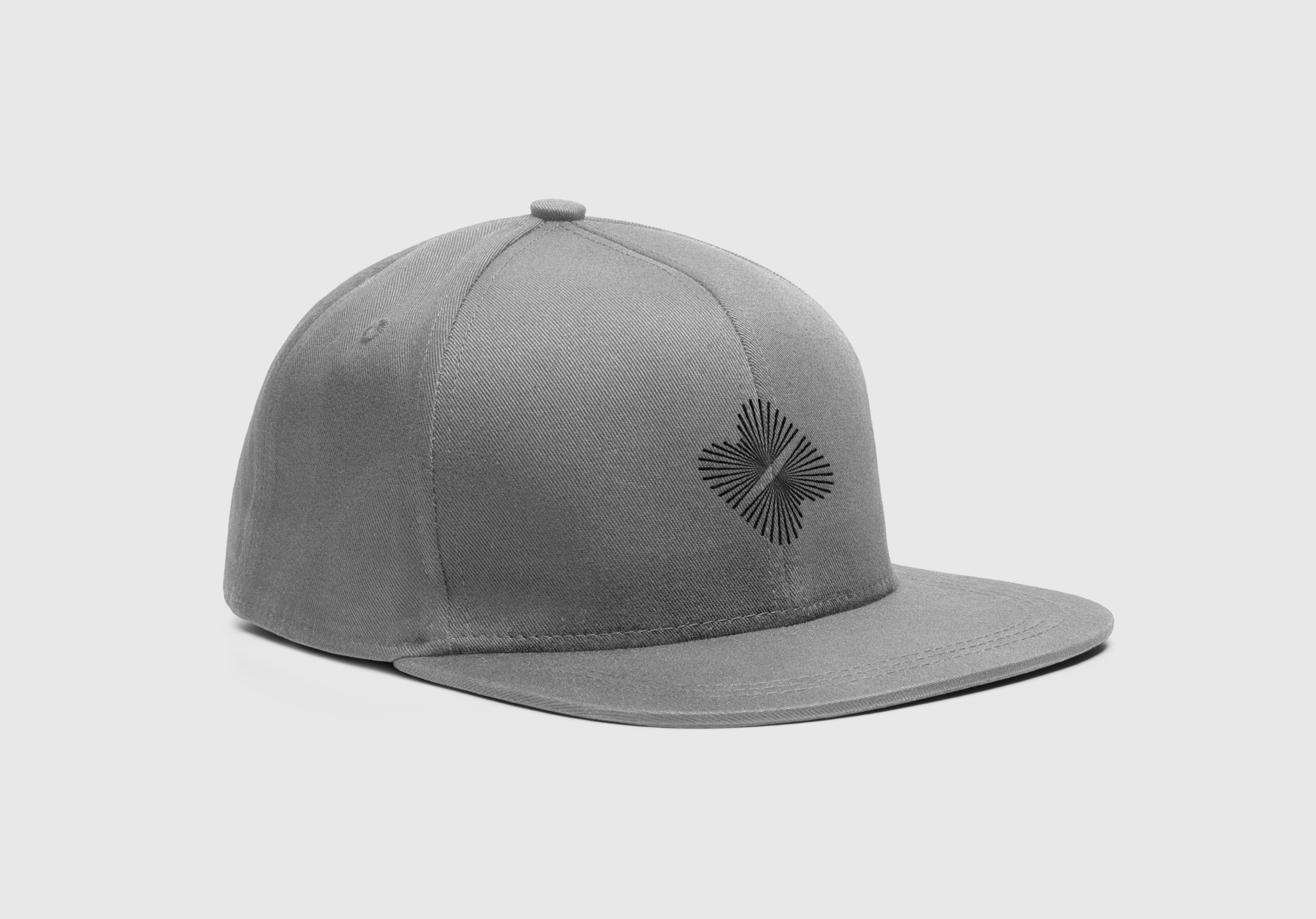
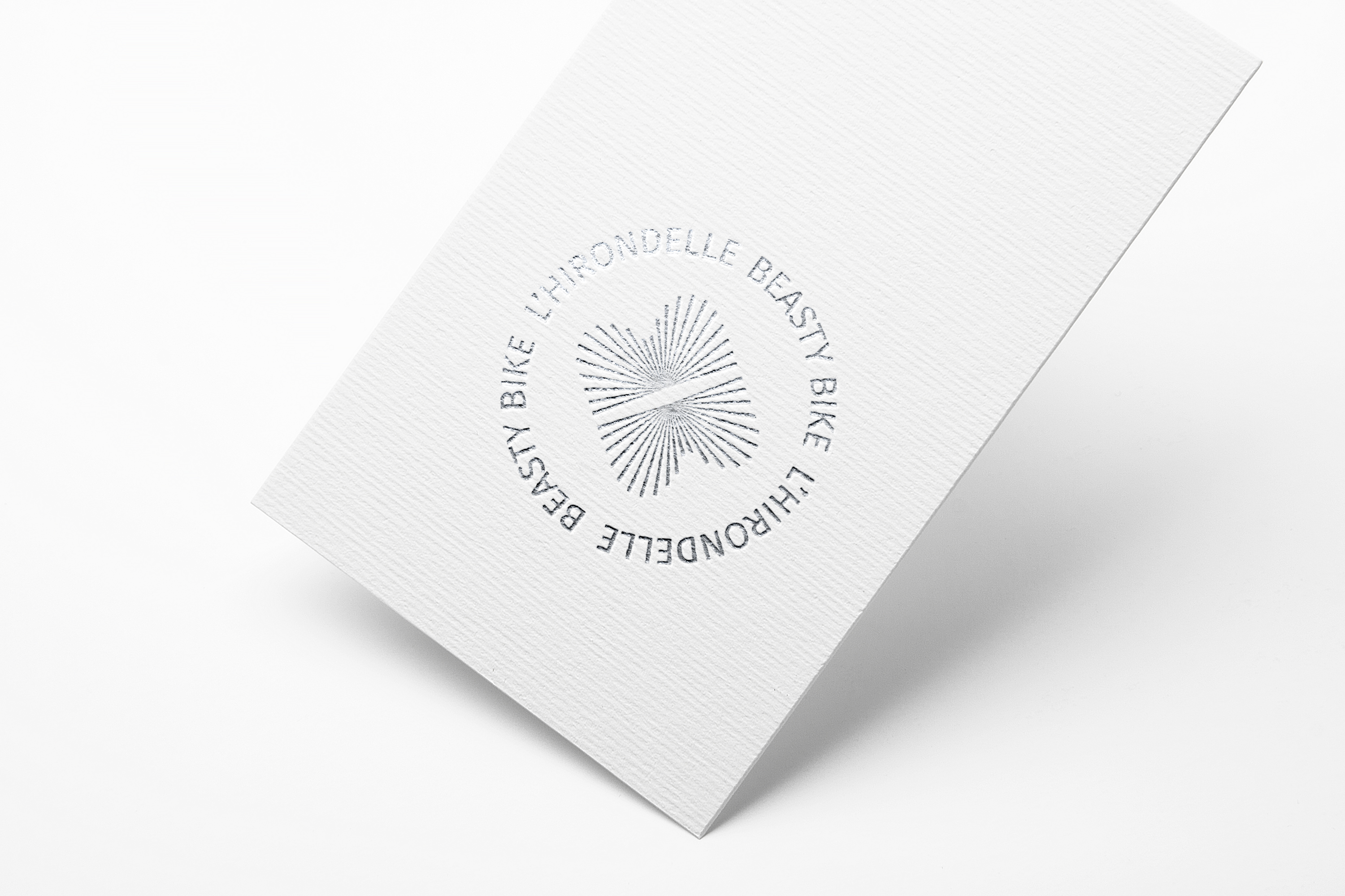
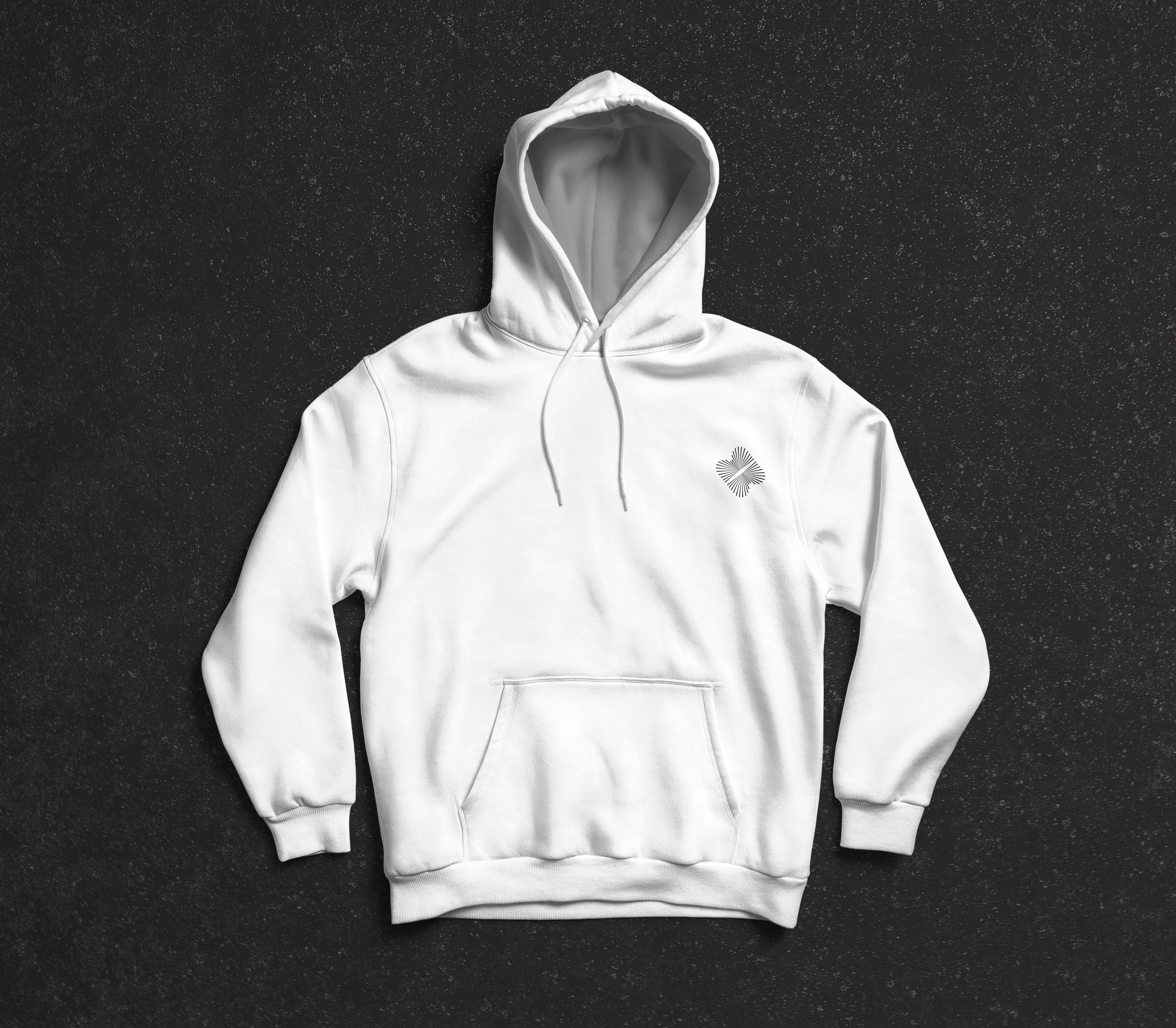
I designed a new visual identity of a brand called Beasty Bike. It is a bicycle dealer which has several shops called l’Hirondelle in France but the name of the website is still Beasty Bike. The challenge was to create a unique visual identity between the shops and the website by keeping both names. I designed a logo within a circle that can be turned. In one direction we can read the “h” of the “Hirondelle” and in the other we can read the double “b” of Beasty Bike.