ANNE-LAURE TREZEGUET
ART DIRECTION/GRAPHIC DESIGN

ABOUT
WORK WITH ME
ANNELAURE.TREZ@GMAIL.COM

@ANNELAURE_TREZ

DATE / 2025
CLIENT / CALI&STONE

BRANDING
LOGO DESIGN
VISUAL IDENTITYWEB DESIGN
PACKAGING DESIGN
PHOTO EDITING

DESCRIPTION /
Rebranding project for Cali&Stone.
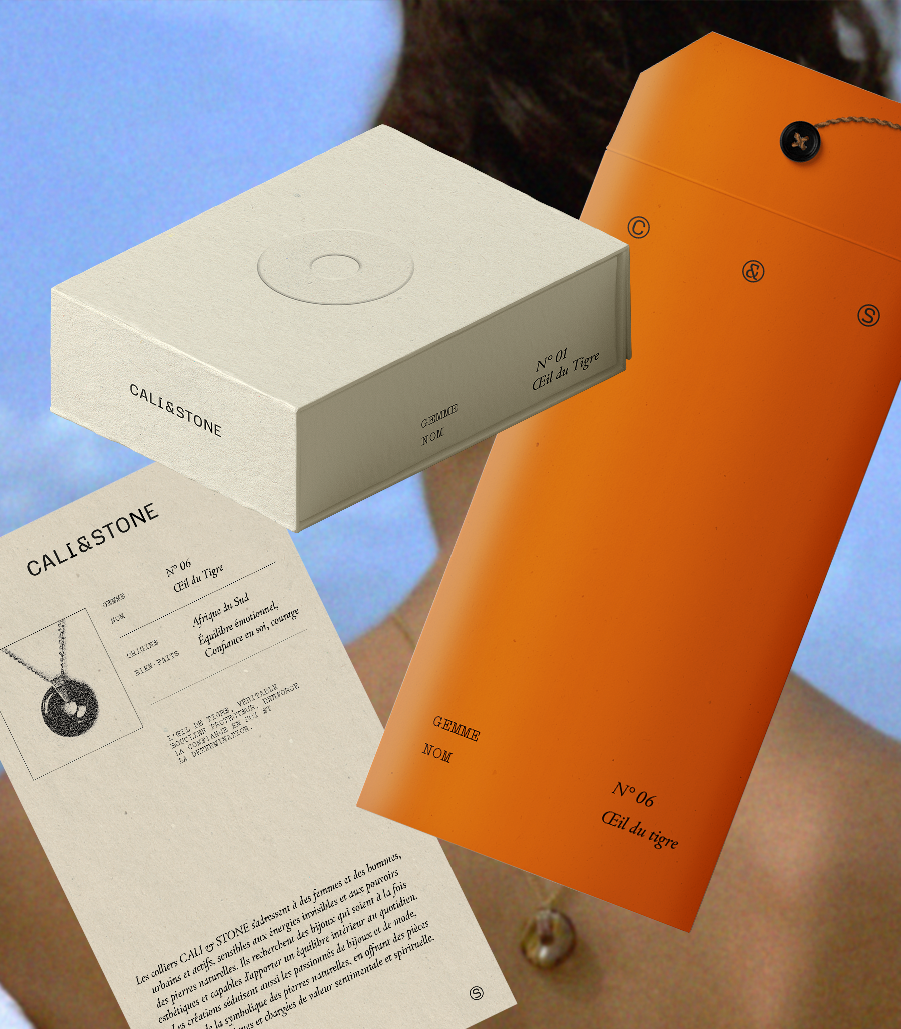
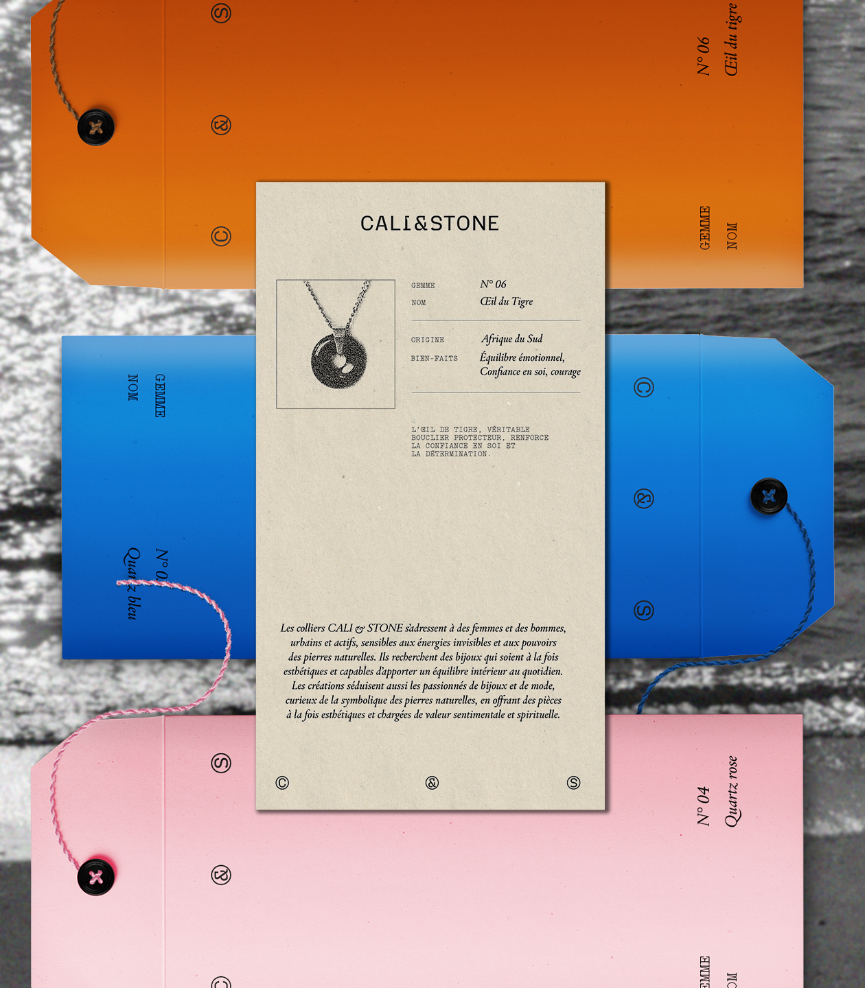
The brand offers six necklaces featuring natural stone pendants, each in a different color. Inspired by lithotherapy, every stone carries its own energy and benefits, which are revealed when worn. Cali&Stone embodies a solar, timeless universe that promotes serenity and emotional balance.
The shape of the jewelry is inspired by the Chinese Pi: a flat disc with a central opening, symbolizing the union of yin and yang, the feminine and the masculine, and inviting the flow of new energies.
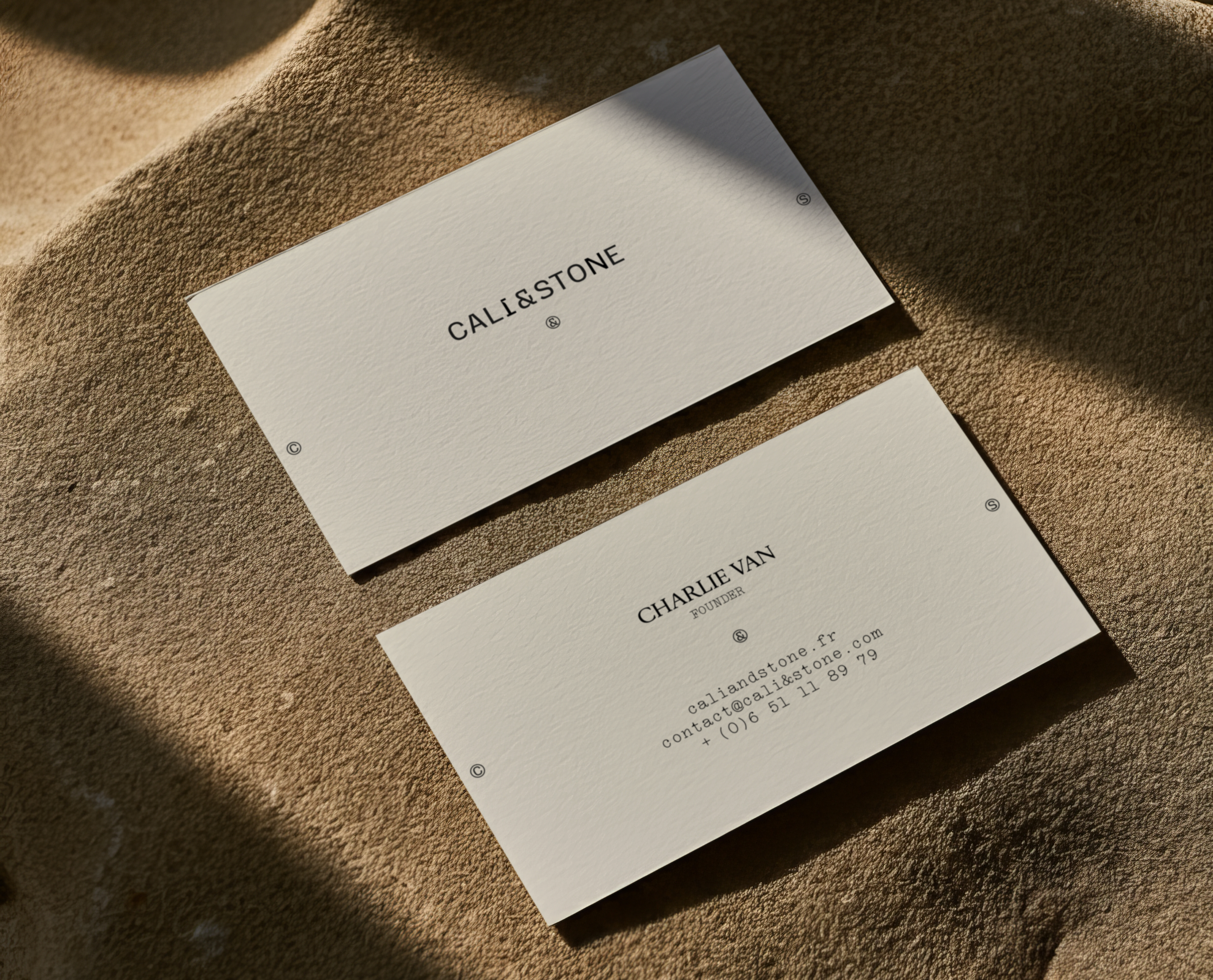
The visual identity is built around a grounded logo whose letterforms look carved, echoing the way natural stones are shaped. It also exists in a circular version where the initials are enclosed within round forms, referencing traditional Chinese talismans. This modular variant adds rhythm and structure to the brand’s communication materials.
The art direction is warm and sunlit, with ivory as the dominant color. It is complemented by vertical envelopes, each matching the color of the stone inside the jewelry box. These envelopes contain the descriptive and identity card of each stone. The chosen typography combines a serif typeface with a monospaced font reminiscent of typewritten information cards, conveying emotion and a sense of nostalgia.
The overall identity expresses energetic qualities through a vintage-inspired graphic style enhanced with photographic grain, enriching the brand’s visual universe and its Instagram presence.