DATE / 2025
CLIENT / UNNAMED PARTNERS

VISUAL IDENTITY
LOGO DESIGN

DESCRIPTION /
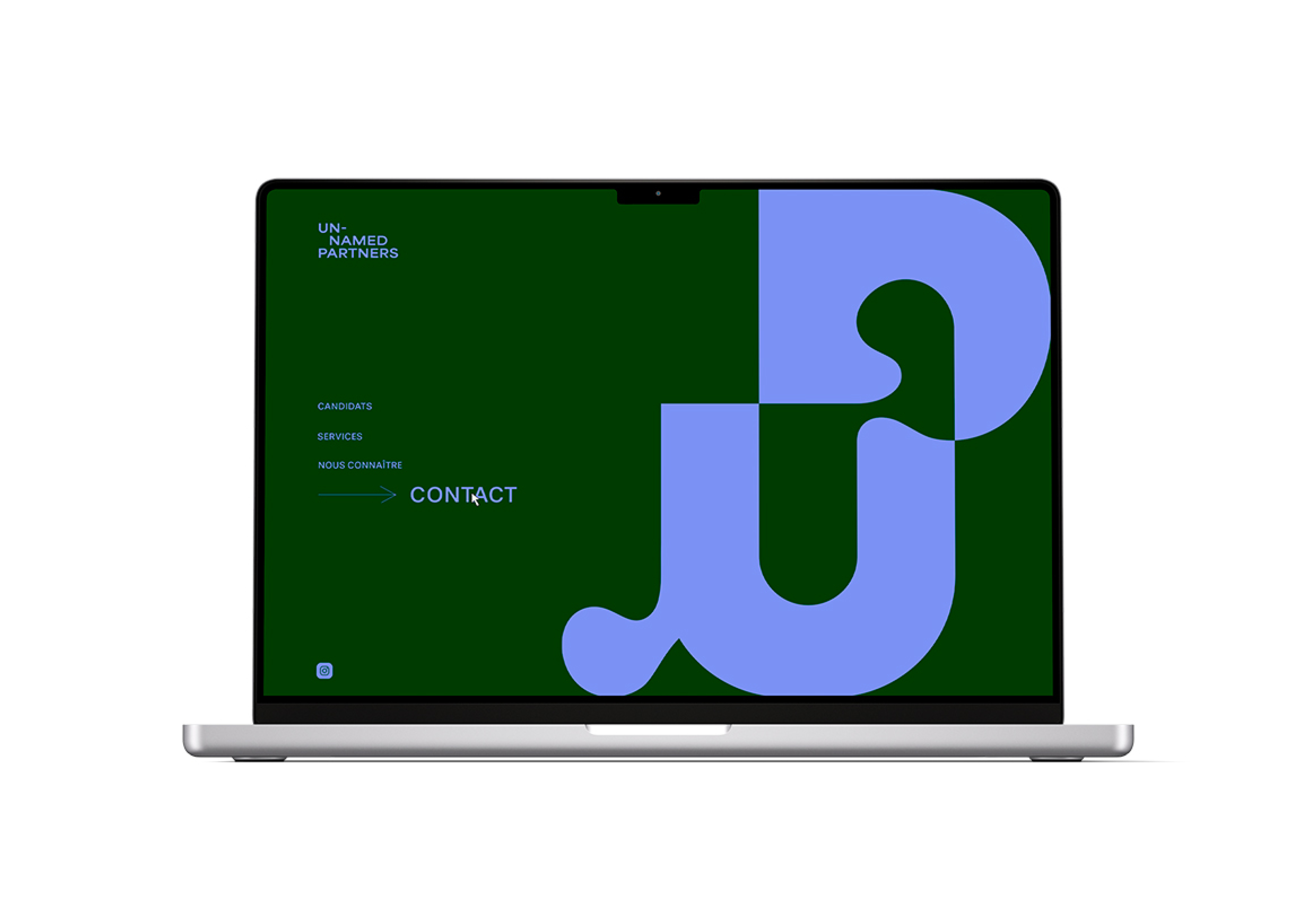
This new visual identity reflects the desire to reinvent the image of a recruitment agency, distancing it from the stereotypes of a cold, impersonal company. The aim is to position it as a human-centered agency, accessible and fully committed to supporting its clients with its expertise.The graphic concept is inspired by the metaphor of a puzzle, illustrating the agency's mission: to find the ideal candidate, the 'last piece' that enables the client's business to come together seamlessly and reach its full potential.
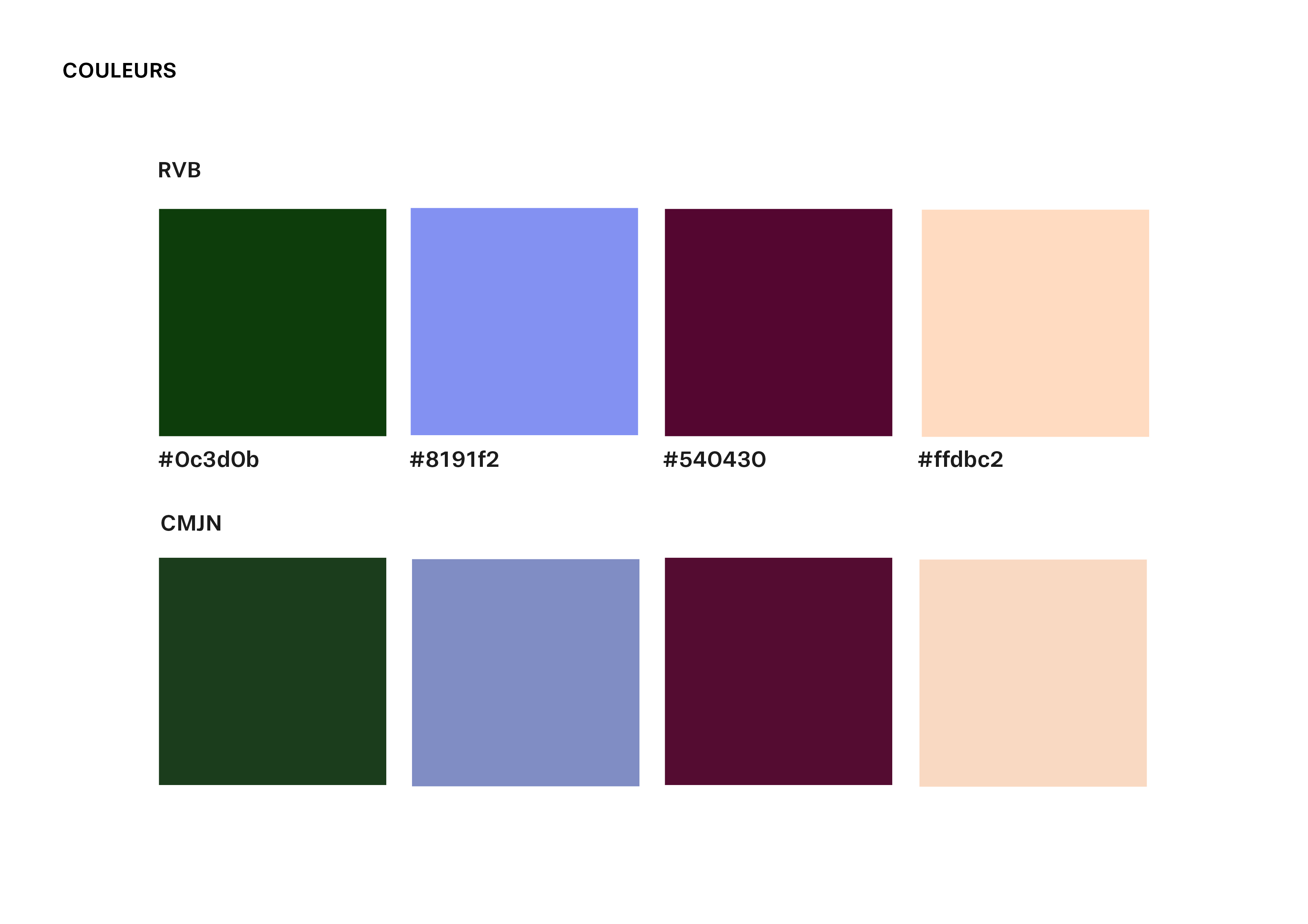
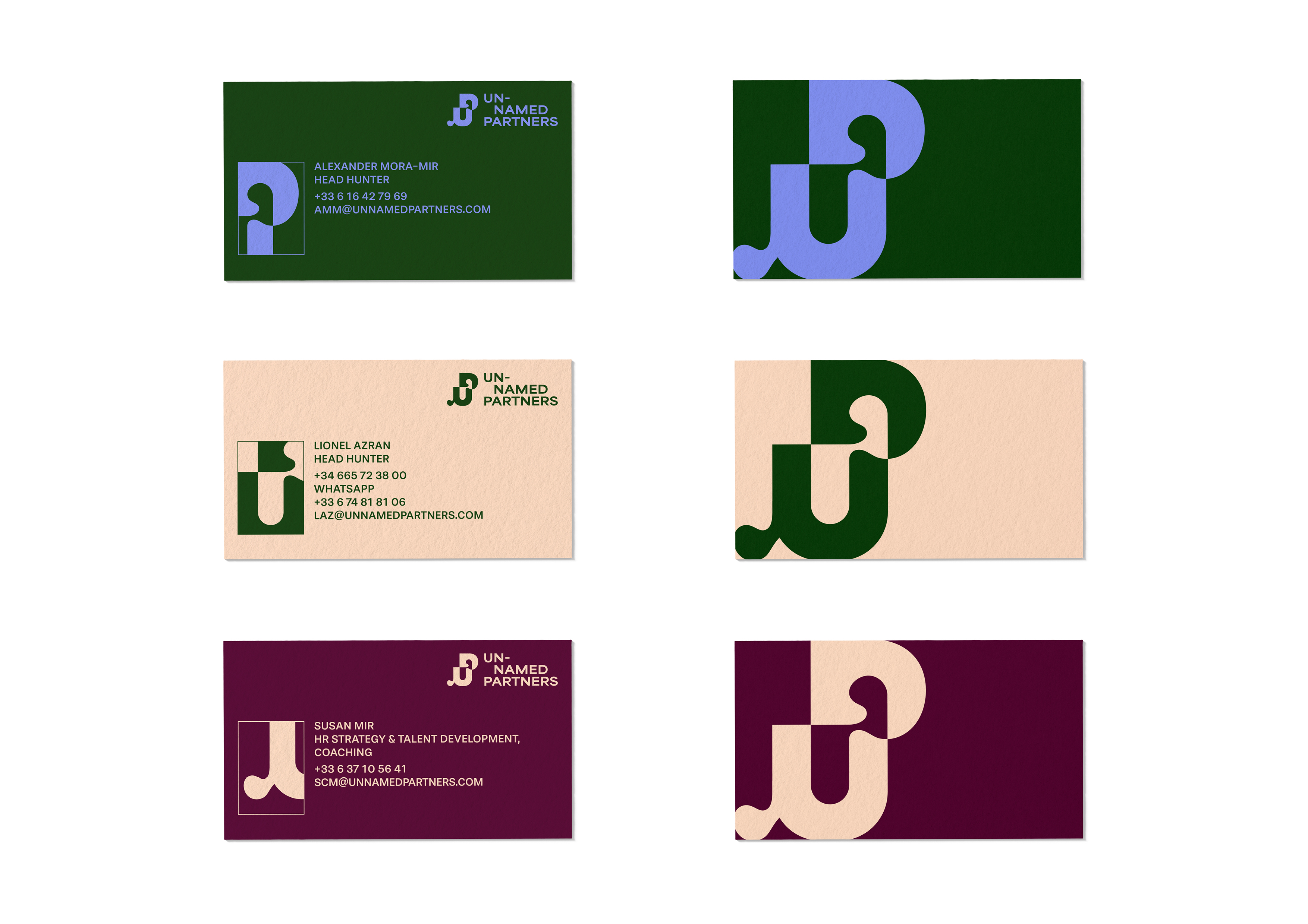
The combination of curved and straight lines in the graphic identity gives the design a warm, friendly feel. As for the colors, they are complementary and bold, breaking with convention while maintaining a professional rigor—ensuring both creativity and professionalism from the agency's associates.
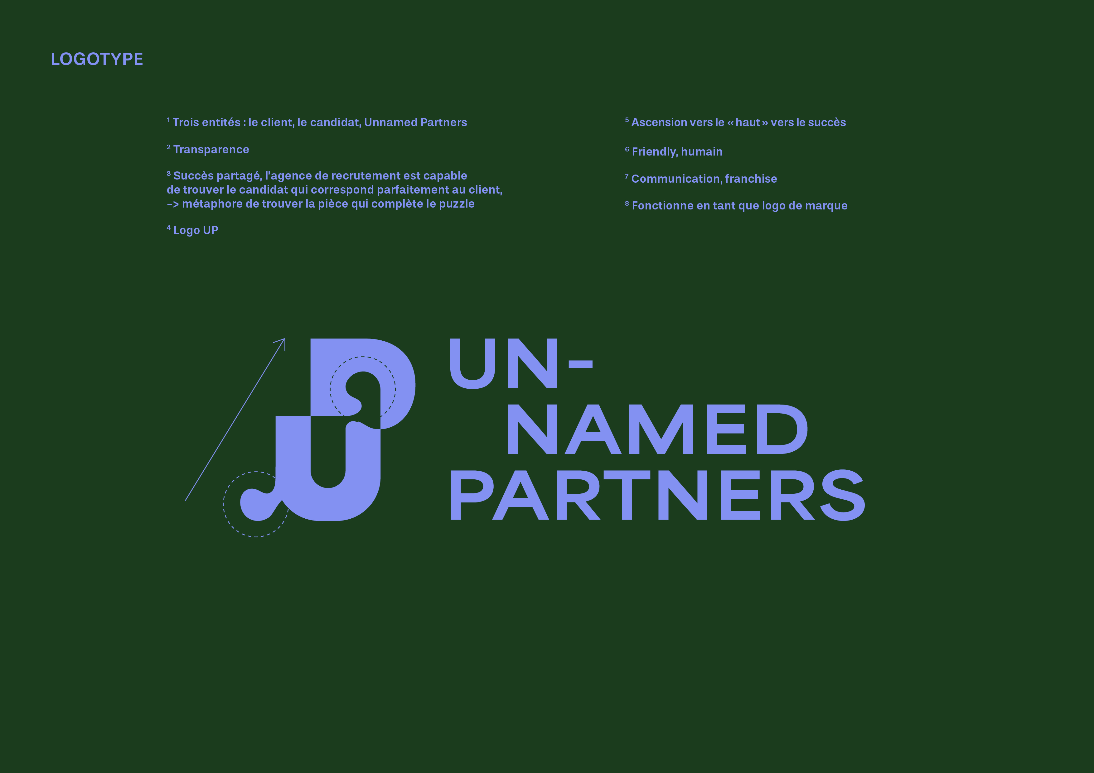
THE LOGO’S HIDDEN MEANINGS /
1/ THREE SIDES:
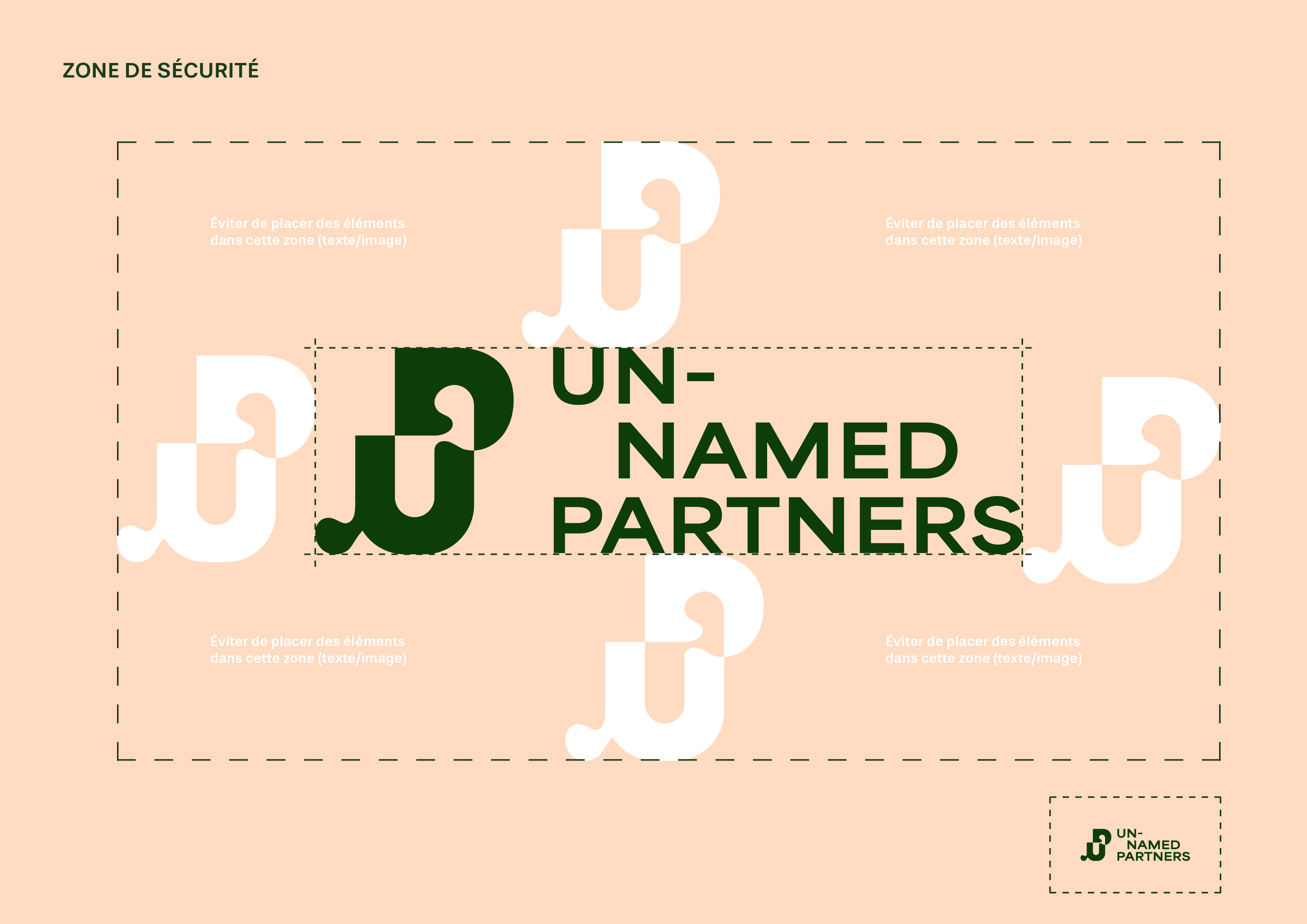
The customer (one purple area), the candidate (the other purple area), and Unnamed Partners (green area that bridges the gap between the two).
2/ TRANSPARENCY:
The design conveys openness and transparency, which are core values of the agency.
3/ SHARED SUCCESS:
Unnamed Partners is able to find the candidate who perfectly matches the customer. Once united, the shapes reveal themselves, symbolizing how the client and the candidate's potential is unveiled when they come together.
-> A metaphor for finding the piece that completes the puzzle.
4/ “UP” LOGO:
Use of the initials U and P.
5/ DIRECTION OF "UP":
The design suggests upward movement, symbolizing progress and growth.
6/ FRIENDLY, HUMAN:
The rounded shapes of the logo evoke warmth and approachability, reflecting the human-centered approach of the agency.
7/ COMMUNICATION:
The rounded shapes look like quotation marks, representing dialogue and communication.
8/ BRAND LOGO:
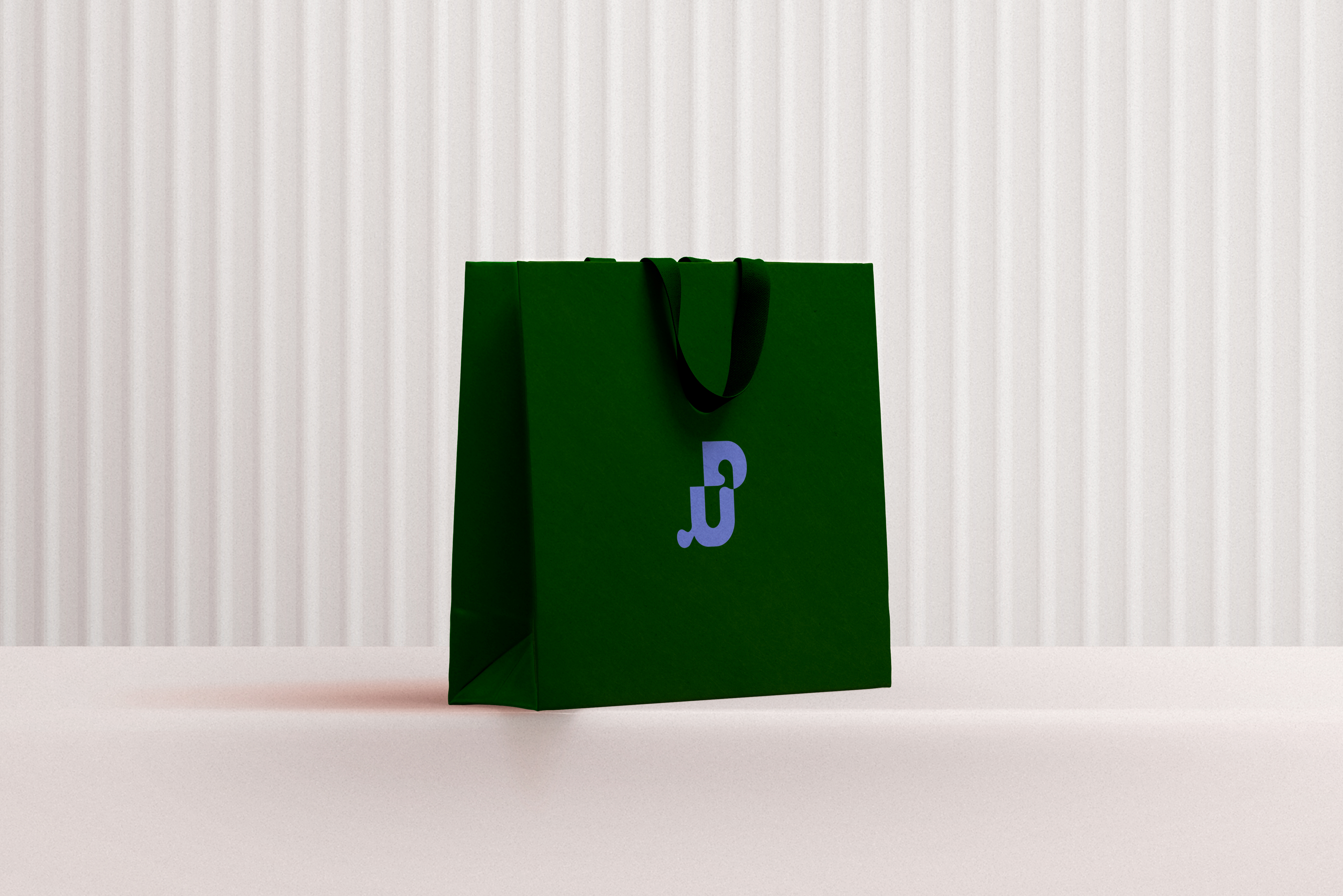
The logo works effectively as a brand symbol, encapsulating the essence and values of Unnamed Partners.


